Journey 1: Search prototype
A filter-led journey for buyers arriving with clear intent, focused on precision, control, and narrowing the marketplace quickly.
Marketplace · Car & Classic · 2021–2022
Europe's largest classic car marketplace had 4 million monthly users and a mobile experience its own users described as "clunky," "20 years old," and "the most painful website I use," yet they kept coming back.
The Story
Four million people used Car & Classic every month, called it painful, and came back anyway. Not because of the product. Because of who else was there.
Car & Classic is the UK's most visited classic vehicle marketplace. Organic search drove 65.9% of all visits. But 85% of those visits landed on a mobile experience that hadn't evolved in years. I was brought in as Design Lead on the Mobile Pod, a cross-functional team tasked with reimagining the mobile product from first principles.
"It's the most clunky website I use. It has some treasures on it that you can't find anywhere else."
- Research participant, active buyer"Site is horrible but there is so much potential."
- Research participant, active seller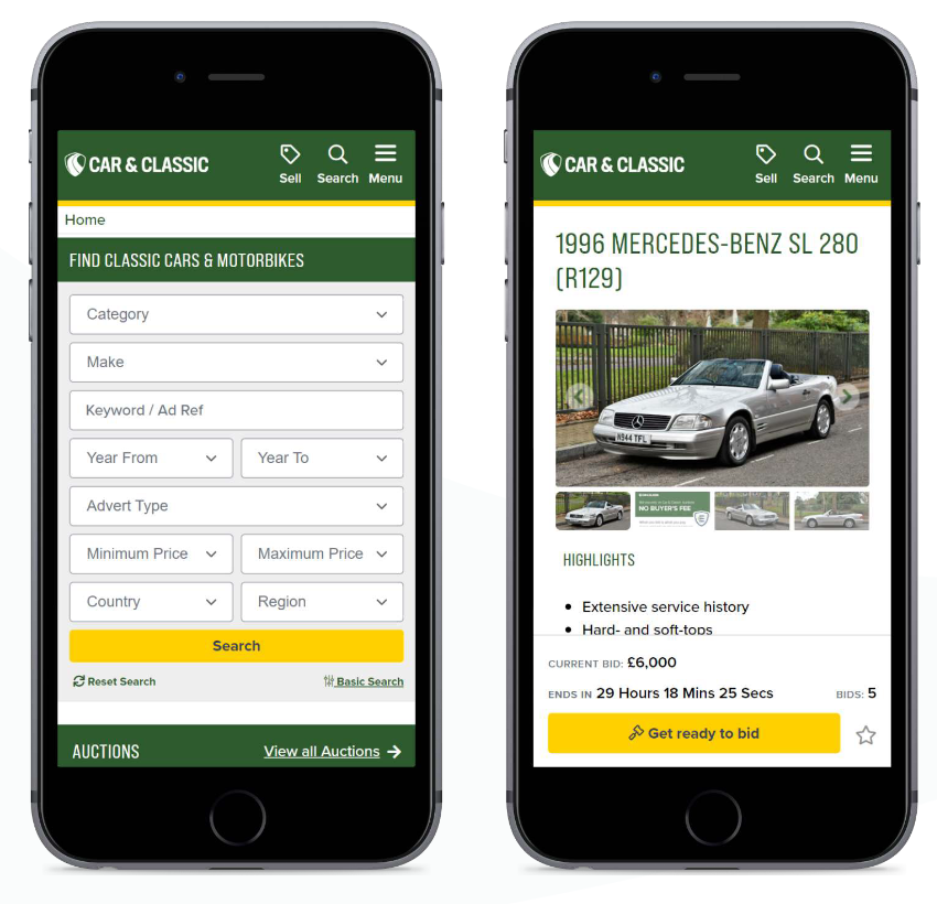
Product Context
A community of connoisseurs had formed around the platform despite its experience, not because of it.
Design Principle
Design to surface the community, not just the catalogue. The trust already exists; the product needs to make it visible.
My job was to turn a fragmented understanding of the user into a shared direction the team could build from. I was also growing a mid-level UX designer at the same time, bringing them through every phase of the research programme, from screener design and interview facilitation through to synthesis and prototyping. Their development was happening in parallel with delivery, not separate from it. The best way to build research capability in a team is to do real research together.
I led the research, shaped the workshop programme, defined the two competing journey hypotheses, and delivered MVP recommendations to engineering for the alpha build.
The framework, designed as the bones of the app's structure regardless of journey design direction, needed to be a structural foundation that could support three connected layers of user behaviour: intuitive search for users arriving with intent, browsing and saving for users building a relationship with the stock over time, and space for serendipity and discovery for users who didn't yet know what they were looking for.
That foundation meant both journeys could be tested on equal footing, neither was being asked to carry the whole app experience on its own. And whichever direction the product ultimately took, the three core behaviours the research had shown users needed would already be built in.
What We Discovered
Before a single screen was designed, I ran two phases of research. Attitudinal first: 17 one-hour interviews with buyers, sellers, and professional dealers, to understand the world the product needed to live in. Classic car buying is emotional, high-stakes, and deeply personal. Transactions range from £5,000 to over £150,000. These aren't impulse buys; they're childhood dreams, weekend rituals, and sometimes retirement plans.
Attitudinal research tells you what people say they do. Behavioural research, usability testing against real prototypes, tells you what they actually do. Running these as two distinct phases was a deliberate methodological choice, not a scheduling convenience.
The interviews gave us the language of the problem: trust, confidence, seriousness of enquiries, and the difference between active buying and open-ended browsing. The usability testing was designed to pressure-test those themes against behaviour, using the two prototype journeys to see where users needed control, where they wanted inspiration, and where the experience had to reduce anxiety.
These questions kept the research focused. They helped the team avoid treating the prototype test as a preference exercise, and instead evaluate which interactions genuinely supported intent-driven buyers and serendipitous discoverers.
"80% of enquiries from C&C are from serious people." Users returned despite the frustrations because of who else was there. The product barely surfaced it.
Enthusiasts don't search like databases. They think by era, by feel, by story. Many weren't in active-purchase mode at all; they were dreaming.
Three participants independently mentioned checking morning email alerts as a ritual. This critical touchpoint was buried in settings.
Users needed to see damage, prior repairs, and engine compartments, not landscapes. Photos were the primary trust mechanism. Poor photos meant skipped listings.
Auctions were "interesting but scary." The experience needed to feel safe before it could feel exciting.
A significant cohort had no specific car in mind. They were immersed in the world of classics. A pure search experience would never serve them.
How do you design for someone who doesn't know what they're looking for?
The question that shaped everything
Two user modes. Both underserved.
My MA research had centred on exactly this tension: how do we keep serendipity alive for consumers shopping online? Digital commerce had become extraordinarily efficient at helping people find what they already wanted, and extraordinarily poor at helping them discover what they didn't know they needed.
User Mode A
"I want a 1967 Triumph Spitfire. British Racing Green. Under 60,000 miles. Tell me where it is."
User Mode B
"I love 1960s Italian sports cars. Show me something I haven't seen before. Tell me the story."
From Opinion to Evidence
I ran a Lean UX Canvas across the business before a single wireframe was sketched. The aim was not to collect more opinions, but to make the existing assumptions visible. The outputs revealed seven different ideas of who the user was and no shared definition of success. That tension became useful: it gave us the raw material for two testable directions.
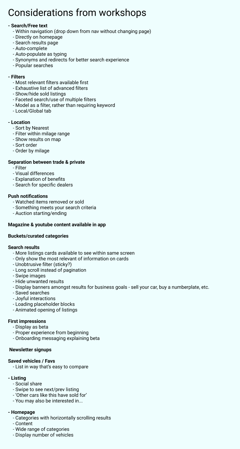
Run async across commercial, editorial, product, and engineering. When I played back the outputs, the pattern was clear: seven distinct mental models of who the user was, and no shared definition of success. That conflict wasn't a problem to manage; it was the raw material for two testable directions.
A cross-functional sprint that turned disagreement into structure. By the end, we had stopped treating search and browse as competing opinions and started framing them as behaviours we could test simultaneously.
This session asked whether the editorial identity of the C&C magazine could live inside a search product. The answer became Journey 2: a browse-led route for users who arrived open to inspiration rather than intent.
Product Context
Organic growth meant every team had built their own mental model of the user. None of them were written down.
Design Principle
Surface the disagreement before designing. Alignment isn't assumed; it's built by making the conflict visible.
The Design Decision
The research did not point to one neat answer. It showed two valid behaviours that the existing mobile experience underserved. Rather than choosing between them in a meeting, we designed Journey 1 and Journey 2 as distinct hypotheses and tested them with users.
Journey 1: Hypothesis A
For the intent-driven buyer. Precise filtering by make, model, era, fuel, transmission, and price. The hypothesis: classic car buyers are expert researchers. Give them control, and they'll find the car themselves.
Journey 2: Hypothesis B
For the serendipitous discoverer. Built around the editorial identity of the C&C magazine. The hypothesis: many users aren't shopping yet; they're in love with the world of classics. Meet them there.
A filter-led journey for buyers arriving with clear intent, focused on precision, control, and narrowing the marketplace quickly.
A browse-led journey for discovery-mode users, using editorial structure and listing previews to make exploration feel more natural.
What Testing Told Us
Testing did not crown a single winner. J1's filter system gave intent-driven buyers the control they expected, but felt heavy for users who were still exploring. J2's editorial approach made discovery feel natural, but users switching into buying mode needed a faster way to narrow down.
The answer was not one journey over the other. It was a synthesis. The listing drawer cut through both prototypes: users could inspect a car in detail without losing their place, which made browsing feel safer and search feel less brittle. It went straight into the MVP.
Precision filtering validated for intent-driven users. Information hierarchy on listing cards confirmed: year, mileage, and location are the first-look decision variables.
Editorial browse highly engaging for discovery mode. The listing drawer, preview without losing context, was the standout interaction across both journeys.
Alert sign-up elevated to a first-class experience. Autocomplete search combined with contextual browse entry points. Listing drawer carried into the alpha build.
The story map made visible what testing had already shown: the moments that repeatedly mattered were discovery entry, listing confidence, and the ability to return. It wasn't a record of preferred screens. It was a structured view of where users needed to trust the product before they'd commit to it. That distinction drove every prioritisation decision in the MVP recommendations.
Search needed to be present immediately, with a future path toward saved searches being surfaced back to users at the right moment.
The fastest route into why the user was there had to be listings, with a future direction where entry points could become personalised to user taste.
Users needed ways to save listings and functionality so they could return later for deeper investigation of potential purchases.
What Changed
The MVP recommendations went into engineering planning in late 2022. Before the alpha build could ship, the business redirected the roadmap because of a strategic pivot driven by commercial priorities that had nothing to do with the research findings. The mobile redesign didn't launch.
What stayed: the research report became the shared reference point the product organisation had lacked before this work began. Stakeholders were no longer debating abstract preferences about the user. They had 17 interviews, two validated design directions, and a clear account of where the existing mobile experience was failing and why. The workshop frameworks were reused by the team independently on subsequent sprints. The validated listing drawer interaction made it into later product thinking.
Good design work doesn't always ship. What it always does, when the research is real, is change who gets to be in the conversation about what comes next.
What I Carry Forward
The clearest impact of the Lean UX Canvas wasn't the outputs. It was the moment I played back seven different definitions of the same user to a room of people who had all assumed everyone agreed. The design conversation changed immediately. It stopped being about opinions and started being about evidence. That shift is replicable on any product, in any company, as long as the research is done before the wireframes.
Most products are built for the user who arrives knowing what they want. The Car & Classic research showed that a significant proportion of the most valuable users, dealers, enthusiasts, and long-term community members, arrived with no specific car in mind. Designing for intent-driven buyers alone would have served the minority and alienated the most loyal. That tension lives in almost every discovery surface I've worked on since.
Seventeen interviews told us what the emotional landscape looked like: trust, anxiety, and the ritual of the morning alert email. The prototype testing told us which of those things we'd actually designed for. Running them as two distinct phases wasn't a scheduling choice; it was the method. The data gave us an answer. Opinions would have given us an argument.
The mobile redesign didn't ship because the business changed direction. That's a real outcome, not a failure. Understanding why a product decision gets overridden by strategy, and being able to talk about it without defensiveness, is part of what senior design experience looks like. The work had value. The value just didn't arrive in the form of a launched product.